
You might notice that your mobile conversions lag behind your desktop ones on a regular basis. However, as people are spending more time on their mobile devices than their desktops than ever before, it’s important you take the time to address low mobile conversion rates if you want to continue to build your business.
Today we are going to look at how the most popular lead generation solution, OptinMonster, can help you boost mobile conversion rates in a variety of ways. We are also going to discuss easy ways you can A/B test each of the strategies to make sure you are giving your mobile audience exactly what they’re looking for.
1. Inline Optin Forms
Inline optin forms are perfect for targeting those that are the most engaged with your content. That’s because inline forms appear with your website’s content and encourage those that are already committed to reading your content to sign up.
Since most mobile users will reach your website’s content directly, completely bypassing your site’s homepage, where it is likely you have a subscribe box for all to see, using an inline form is especially helpful.
Because of this, you need to add subscribe forms in different places on your website so you make sure mobile users have the chance to sign up. And it just happens that adding an inline form right in the content you are guiding them to in your emails and on social media is the best way to do just that.
When it comes to your inline forms, it’s a good idea to A/B test a variety of elements to make sure mobile users like what they see and want to subscribe.
Here are some of the best things you can A/B test on your online forms:
- Button colors. Test the colors of your call to action buttons to find out which color readers are more drawn to.
- Headline copy. Figure out which language inspires the most conversions. For instance, you might test the phrase “No” versus “No I don’t like money” and see if dangling the chance at earning more money is enough to get readers to subscribe.
- Content upgrade offers. Try offering different content upgrades – eBooks, PDFs, list, free software or tools, and even online courses – and see which ones your readers want the most in exchange for giving up their email address.
Lilach Bullock does a great job of offering a content upgrade inline form in her latest blog posts.
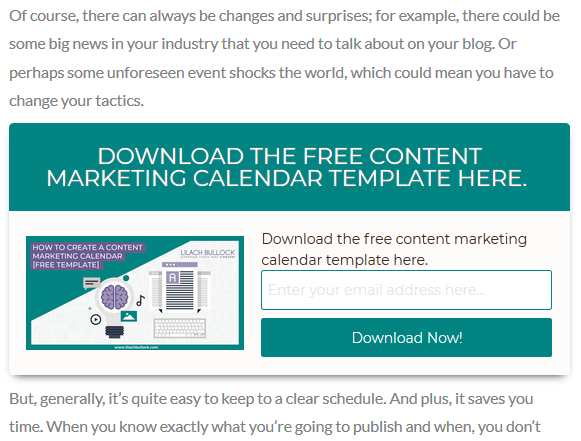
Her color scheme matches the look and feel of her website, the call to action button copy is exciting and has a clear message, and she even includes an image that relates to her lead magnet offer. Not to mention, it’s right in the middle of her blog content so it’s sure to be noticed by those engaged with her content.
Another great A/B test to run on your inline forms is the placement. While you can place the form in the middle of the content, this may interrupt your reader’s experience and cause them to abandon the form. That’s why there’s always the option of placing the inline form at the end of the blog post, as The Advisor Coach has done.
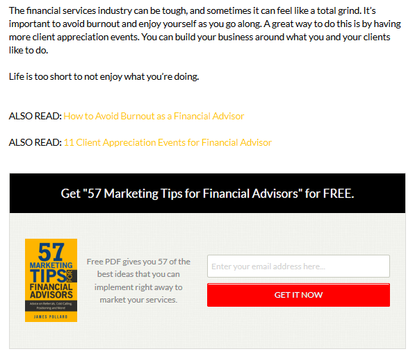
This way, those that are truly interested in your site’s content can finish reading what you have written, and then subscribe willingly to your email list.
2. Inactivity Sensor Popups
With 80% of smartphone users never finishing their online purchases, it’s especially important to target those that are abandoning your website before converting.
Luckily, with inactivity sensor popup forms you can display a form for site visitors about to leave your site, similar to exit-intent, but pop up when the user stops scrolling instead. From there, you can begin to build a relationship with customers that may not fully trust you, may be unsure about your products or services, or may be on the lookout for better deals.
When it comes to displaying the best inactivity sensor popup forms, here the main things to split test:
- Button Placement. See how changing the sides of your call to action button affects conversions.
- Offers. Try giving your customers or readers different offers such as coupons, free shipping, an eBook, or access to exclusive web content in exchange for an email address.
- Overall Design. Sometimes changing the entire design of your popup form will lead to more conversions. Choose different images and templates to see which ones your site visitors like the most.
One of the best examples of exit intent technology in action is the popup form that Digital Marketer displays for those about to leave.
This popup acknowledges their site visitor is about to leave and gives them a good reason to stick around by offering a great deal. In addition, the form matches the site’s overall branding design, the subscribe button color is highly visible, in contrast to the No button, and the fact that they use Yes/No copy is great for appealing to people’s fear of missing out on a great deal.
3. Sticky Headers
One of the biggest reasons mobile users leave your site before converting is a poor user experience. In fact, 57% of people won’t recommend a business with a poorly designed website. In addition, you may not want to bother your site visitors with a popup form as they navigate your site on their small mobile device.
That’s why using a sticky header to highlight sales, showcase seasonal offers, and promote limited-time offers is so crucial to your mobile conversion rate.
Here are some ways you can change up your sticky headers to see which ones convert the best:
- Timing. Set your sticky header to appear when people click on your site or when they are about to leave your site.
- Message. Offer special deals, run a contest, give a content upgrade, or simply ask people to subscribe and see which message makes people convert the most.
- Behavior. Enable Cookie Retargeting to remember those that have visited your site before, activate Geo-Location Targeting to display for those in certain regions, and even include Page-Level Targeting so the right message is shown to the right people every time. By experimenting with these behaviors, you can see which ones resonate with site visitors more.
Kennedy Blue does a great job of showcasing a sticky header in the homepage of the website.
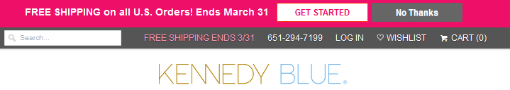
They offer an unbeatable price that’s time sensitive, have a design that matches their brand, and make their call to action buttons clear so the site visitor knows exactly what to do and what they’ll get in return.
4. Two-Step Opt-ins
Two-step opt-ins are an excellent way to convince mobile users to finish converting. Simply turn any link or image into a two-step opt-in form that reveals a popup asking them to subscribe.
The reason this works is based on what is called the Zeigarnik Effect, which recognizes that there is a certain level of tension that builds up in people when they don’t finish something they’ve started.
If you are interested in creating a two-step opt-in form on your website, you might want to A/B test the following:
- Optin Steps. If you want to make sure your site visitors are reacting positively to your two-step opt-in forms, consider split testing them against one-step forms and see which ones convert the most subscribers.
- Social Proof. Try adding social proof on the first part of your opt-in form that will encourage site visitors to click and continue subscribing. For example, add the number of satisfied customers, existing subscribers, or even an official stamp of approval that’ll lend credibility to your brand.
- Form Copy. The copy you use on your form is the key to getting people to click and subscriber. Test different Yes/No phrases and see which ones your site visitors like the best.
WPBeginner does a good job of integrating a two-step opt-in process on their website to get people to sign up. To entice people to click the first part, they give away a free resource.

Then, after you click the first part, you are taken to another form so you can download your free WordPress toolkit.
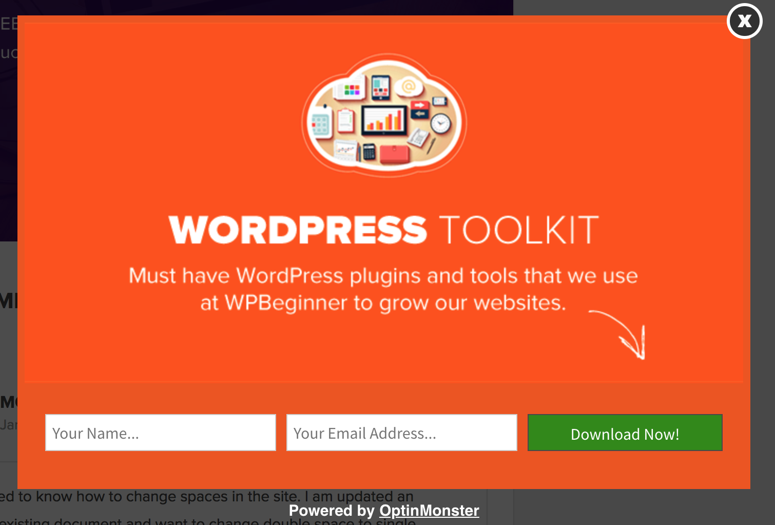
The idea here is that once the site visitor clicks the first part of the form, they’ll be compelled to finish subscribing because they’ve already started, thus boosting your conversion rate.
5. Content Locker
Using the content you are already publishing on your website, you can boost mobile conversions by locking some of it up in exchange for an email address. In fact, you can enable this type of form to appear midway through a blog post, requiring a reader to subscribe before continuing.
The content locking feature will blur all the content below the form, forcing readers to opt-in before being able to see the entire post. And, since your reader has already begun to read something that interests them, they will be compelled to sign up just so they can finish the article.
If you want to use the effective content locking technique, try split testing the following elements to increase the number of subscribers:
- Links. Try testing out whether people are more likely to click a link versus a button to open up the content lock.
- Images. Your readers may subscribe more often if there is an image on your form versus a minimal form that simply asks for users to subscribe to release the content.
- Placement. Find out where in the content readers are more likely to subscribe to open up the content lock. You might not be engaging readers enough to get them to sign up when they hit the blur.
One of the best use cases of content locking comes from the website Whole Whale.
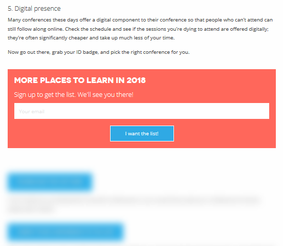
They offer an enticing list of non-profit conferences occurring this year, but stop before listing them and ask readers to subscribe first.
Final Thoughts
There are so many ways to use a lead generation solution to boost mobile conversions depending on your overall goals.
The good news is, there are plenty of A/B tests you can run to see which type of opt-in form your site visitors like the most. Plus, you can A/B test individual elements on every form and watch your mobile conversions skyrocket in no time.

Syed Balkhi is an award-winning entrepreneur and online marketing expert. He is the co-founder of OptinMonster, WPBeginner, MonsterInsights, WPForms, and SeedProd.