The fixed navigation trend is wildly popular for both desktop and mobile users. Since a website’s navigation can always be accessible, it helps users browse the site and skim content faster.
But creating this fixed nav yourself can be a hassle. Thankfully you can just nab a WordPress theme that comes with this functionality by default! I’ve organized a few of the best WP themes with fixed navigations mixing in a variety of styles to choose from.
Weston
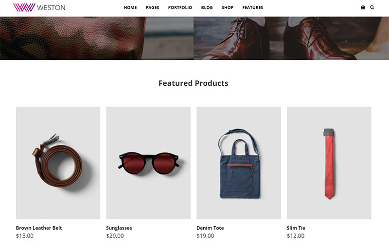
The Weston theme covers dozens of styles and many different website themes from portfolios to landing pages and minimalist ecommerce shops. But every style has the same fixed navigation technique on every page.
The very top navbar scrolls with the user so it stays fixed at the top of the screen. This even works on mobile devices where the screen is much smaller, but the navbar doesn’t take up much space either.
This responsive navigation menu also uses the three-bar hamburger icon. It’s a staple for mobile menus and it encourages users to click through into more pages.
Weston offers plenty of variety and comes with lots of premium features, but it may be too much for a typical blog design. Still it’s an excellent theme to keep in mind if you like the fixed sticky navigation style.
Beckett
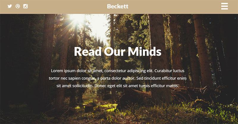
If you like focused designs then Beckett might be more your style. This theme plays a lot with photography and fullscreen imagery to draw attention from the visitor.
The homepage can be styled however you like but it’s mostly geared towards creative portfolio work. The top navbar scrolls with the user and takes up the entire screen when opened. This navigation technique is pretty common on sites with only 3-5 navigation items.
Beckett does this right by keeping focus on the content without a distracting topbar. The color also changes to add some contrast against the page’s simplistic color scheme.
Sydney
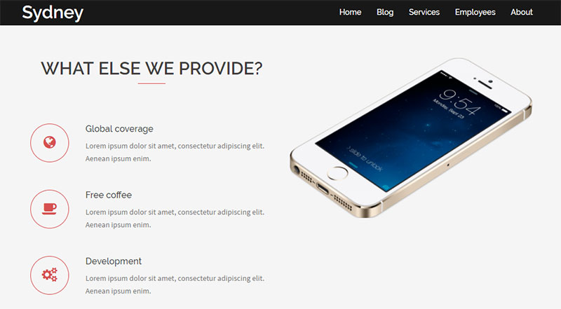
Sydney is a broad theme with plenty of value for business & agency websites. Really amazing design with some unique features like testimonials, skill calculators, and portfolio entries.
If you scroll down the page you’ll notice the sticky navigation actually shrinks a bit. This is very common in themes that try to save screen space without jeopardizing the user experience. All the links are still easy to interact with in this smaller navbar.
However mobile users do not get the fixed navbar so it only follows scrolling on larger screens. The physical screen space is valuable on mobile so it really makes sense to work with a theme like this if you want a simpler responsive design with a variable fixed navbar.
Create
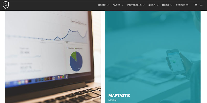
Here’s another flexible theme with many different styles, all of which you can pick from and launch quickly. Create has 5 different homepages and they all feature the top fixed navbar design.
It uses a sliding effect where the navigation slides down from the top of the screen. It adds a little life into the design which is rarely found in other themes. But the Create theme isn’t made for every type of website.
It’s primarily for digital agencies using custom portfolios along with a detailed multi-tier dropdown menu. This makes it great for any website with a lot of pages and it’s a nice pick for any non tech-savvy individuals.
Infinity
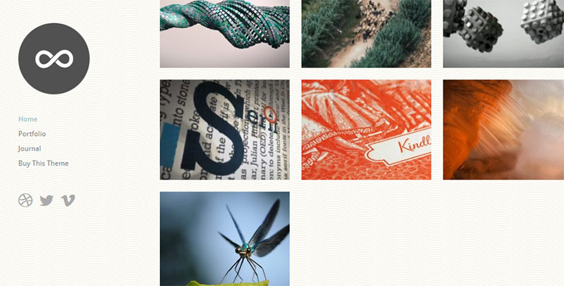
Some modern WP themes use the vertical navigation to draw attention to links along the side. This mixes up the user experience a bit and it creates a very different type of fixed sticky navigation.
Infinity is a portfolio theme which is why the vertical sidebar navigation works so well. It relies solely on links to inner pages and social accounts, all of which stay positioned as the user scrolls down the page.
This limits the overall page style on desktop since the sidebar is always visible. But mobile users get a very different experience where the navigation rearranges towards the top and does not follow the user down the page.
It’s yet another quirky design that uses the fixed nav feature when it makes sense, but removes it on smaller screens where space is at a premium.
BlackWhite Lite
For a magazine-style blog you might look into the BlackWhite Lite theme. This comes with all the bells & whistles of a modern online magazine with the added bonus of offering a totally free theme alternative.
With the logo above the navbar it adds a bit more height into the header. But as you scroll down the page this navbar remains fixed at the very top.
It supports dropdown navigation too which is huge for larger blogs. And these dropdowns are usable even from mobile devices with the sliding hamburger menu. It’s a staple for magazine-style sites and most responsive layouts in the modern era.
BlackWhite is far from the only magazine theme out there. But it’s one of the few with a clean design and a fixed topbar that compliments the layout well.
Port
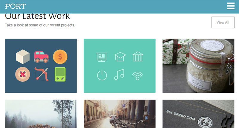
For an agency theme there’s a lot to say about Port. It uses a large header photo that immediately grabs attention, coupled with strong typography and clean horizontal page sections.
This horizontal rhythm works really well with fixed navigation bars. Port’s top nav is very thin and super easy to use, especially on mobile devices where users are tapping with the tip of their fingers.
I do think the sliding menu is a bit small but this can be edited with some code tweaks.
Port is really made for agencies and smaller companies that don’t have many pages on the site. It’s a reliable theme with a quality design and definitely something you can use for almost any company homepage.
Gear
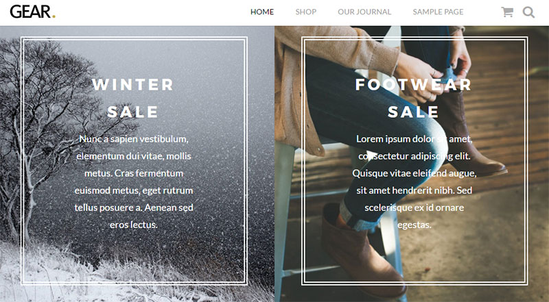
Ecommerce has so many alternatives beyond WordPress, but the WooCommerce system is still a favorite of many. With the Gear theme you can launch a killer ecommerce shop using a clean design and a strong fixed navigation.
The logo in the top-left corner stays fixed alongside the nav links so you get consistent branding across the website. But this top bar also grants access to the user’s shopping cart and the search feature.
All-in-all it’s a pretty simple layout. But that’s exactly what you want for an ecommerce store.
Trail
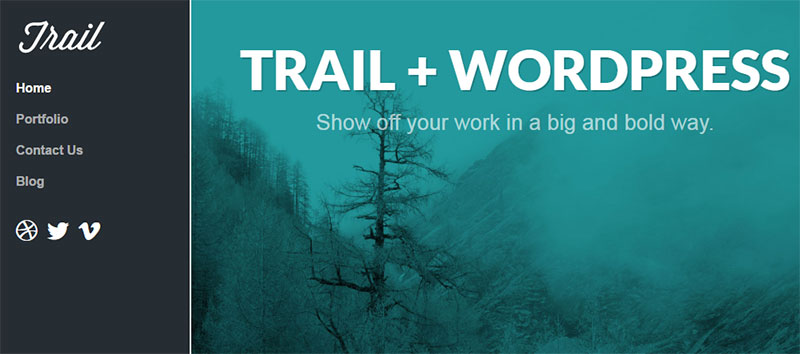
Trail offers a darker alternative to the vertical side navigation. This is yet another portfolio theme where the focus goes right back to the main content.
However with this darker sidebar you get a mix of dark & light together. The main site content uses a white background so this contrast adds to the divide between the site navigation and the portfolio content.
With the fixed nav position it also grants users quick access to everything. And of course the responsive layout hides this navigation behind a hamburger icon which makes it far easier to use on smartphones.
Blog Lite
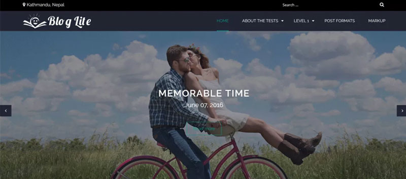
My last recommendation is Blog Lite which follows a traditional blogging design. This also comes with a bunch of extras like featured image support and custom homepages.
While browsing the site you’ll notice the fixed top navigation bar shrinks a bit and resizes the fonts. These links are still accessible but there isn’t as much room for dozens of links across the whole menu.
Thankfully this theme also supports dropdown menus which are very common for bloggers.
If you want a clean design with a fully-responsive fixed navigation then Blog Lite is an excellent theme to pick up and test.
Moving Forward
Each type of website has different needs for design, aesthetics, and custom features. This post offers the best themes across the whole spectrum with fixed scrolling navigations.
So whether you’re launching a new company website, a personal portfolio, an ecommerce shop or a new blog, one of these themes is sure to help you get online fast with a stellar design.