An online portfolio is mostly content-oriented where the user has to take initiative to browse through the website. Your goal is to present your work clearly and encourage users to click around.
In this post I’d like to share some techniques to help visitors get deeper into your portfolio work. There are many different ways to do so, some people just add static pages while others add slideshows and full case studies.
Granted the type of work you do will play a factor in your site’s design. But these tips are universal and can apply to any portfolio site on the net.
Dynamic Categories
If you do many different types of work you should try adding dynamic sorting tags onto your portfolio page. This lets visitors browse the work they want to see rather than skimming through everything you’ve done.
For example, a digital designer might have many different types of work and each portfolio entry might showcase a different skillset. Those categories might break down like this:
- Identity design
- Icon design
- Websites
- Mobile apps
- UI/UX wireframing
If you create dynamic categories then visitors can browse by each one individually. This makes browsing the site a lot quicker and it’s the strongest way to present portfolio work.
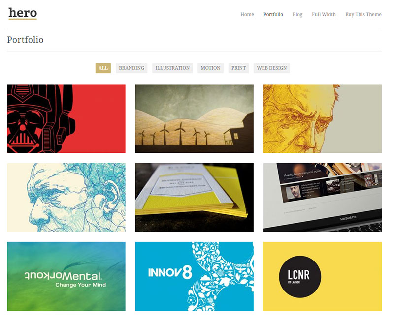
The Hero theme is a fine example of this category sorting in action. The main portfolio page uses small tag links near the top for organizing different project styles.
When the user clicks a category link the portfolio automatically hides all projects besides those added into the category. All of this is controlled by WordPress on the backend so you just have to add projects into your site and organize them accordingly.
Many WordPress portfolio themes come with these features by default and they’re fantastic. You can see another example in the Beckett theme which uses simple text links.
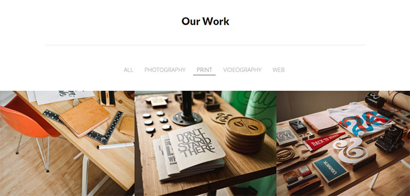
But notice how both examples are basically fullscreen designs and the portfolio takes up the majority of space on the page.
Dynamic categories work best when they’re easy to use and easy to browse through. These examples offer a great place to start and you can even use these themes for your own site if they fit with your design style.
Project Photo Slideshows
The vast majority of project slideshows are used as extra elements on a portfolio project page. So these slideshows add a certain level of detail into the page where you can browse through photos at the click of a button.
I like slideshows because they offer a glimpse into the workflow without taking up much space. But you should use them sparingly.
Sometimes visitors prefer a gallery of thumbnails to flick through all at once. But slideshows have their place if they aren’t too large and don’t’ have too many slides(let’s say under 15).

Bramble supports image slideshows on the portfolio pages and they’re fully responsive too. This lets you browse through photos quickly and it has two different methods for navigation:
- Left/right arrows
- Dot navigation for each slide
Smartphone users can still work through this slideshow with ease and get the full effect. But there’s also an argument for thumbnails since the user can tap to expand the photo larger.
Your ideal portfolio slideshow depends on the type of work you do. If your shots can fit into a slider horizontally then definitely consider adding one to your project page.
Or you might even add one to your homepage like in the Oshine theme. Specifically this demo presenting interior design & architecture.
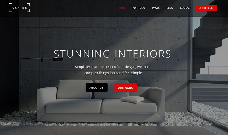
This unique style works well for photographers, digital designers, and digital artists. Those styles of work tend to be fairly large and fit well into a fullscreen slideshow.
Homepage sliders immediately grab attention so they also help sell exactly what you do at a glance.
Just make sure you read up a bit on carousels to learn some best practices for navigation and auto-forwarding.
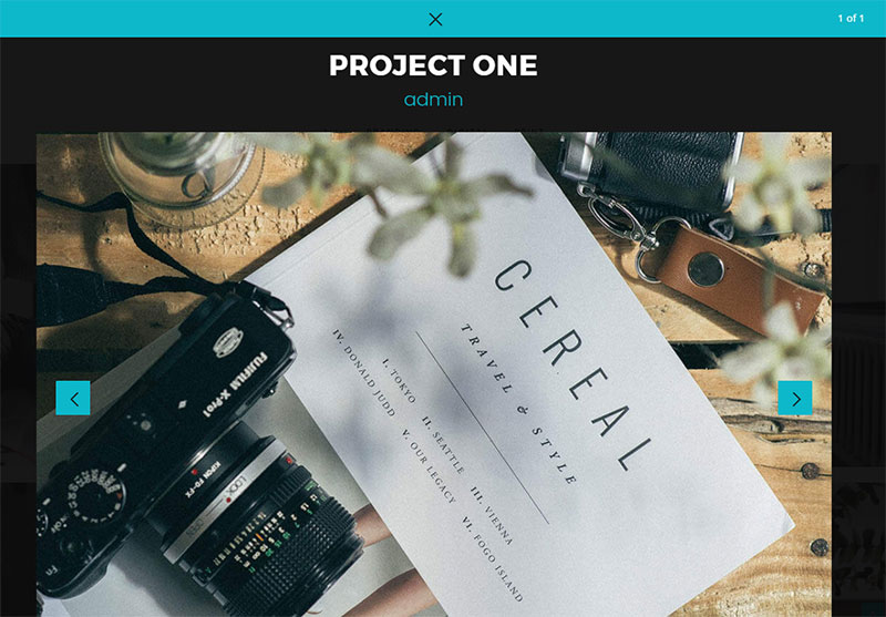
Modal Boxes
This is my preferred technique for presenting portfolio work. The modal window box appears “on top” of the page by graying out the content underneath.
This usually comes in the form of an image gallery where the user can click(or swipe) through many project images at once. Since the modal window appears on top of the page it can take up the entire page without annoying the user with a new tab.
A fantastic example of this is the Vitae theme on ThemeForest. It comes with lightbox modals on each portfolio item page where you can click to see a larger view of the image.
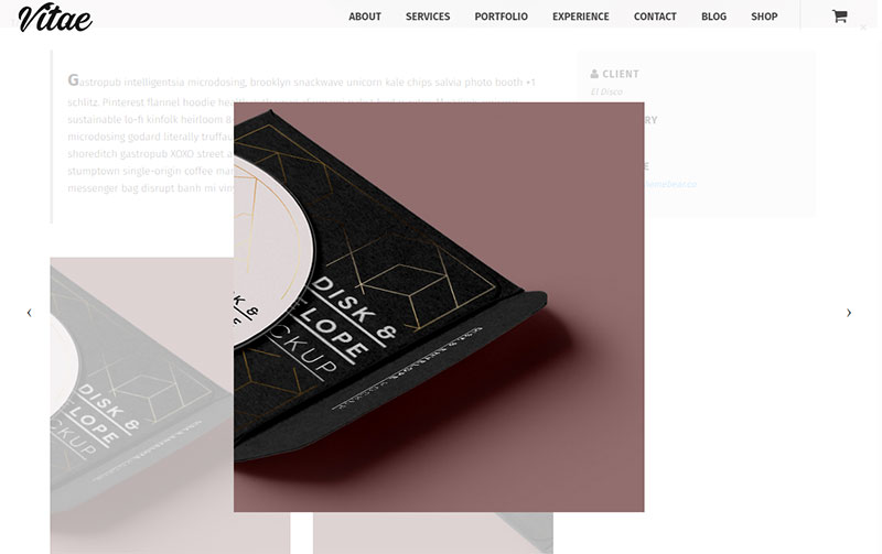
I personally prefer the darker background since this really adds contrast between the modal window and the contents. Some themes like Vitae use a lighter background and this works fine too.
The goal is to increase user engagement by forcing this modal above the entire page. When you do this with a modal popup window it can be super annoying. But it works surprisingly well for portfolio content when the user is expecting it.
I recommend this mostly for gallery items where you have many photos that you want to present in one series. Dark modal windows can also present full portfolio items like with the Honshi theme.
If you have a series of photos that go together in a set consider running them with modal slideshows. Or if you’re a designer you might add different stages of your work into a slideshow, almost like a progression from start to finish.
Any type of visual portfolio site can benefit from modal windows. You just want to find a portfolio theme with this feature and include it naturally into your project pages.
Fullpage Case Studies
It’s always good to add some written content alongside your portfolio work. This way visitors can get a sense of what the project is like, the work you did, and how you moved from the initial planning phase to completion.
Case studies are the best for presenting a full picture of the project. You should naturally have lots of photos on the page, but also include personal anecdotes and lists breaking down your entire creative process.
Visitors want to learn more about what you do. These case studies build trust and present you as an authority on the subject.
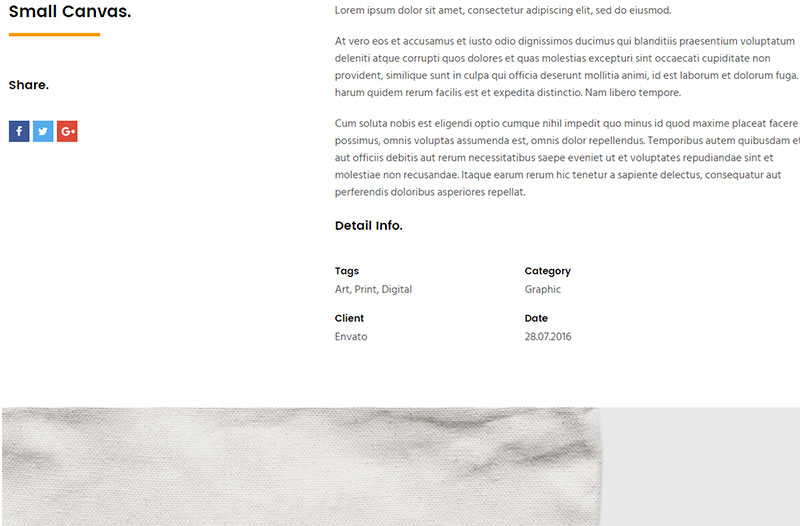
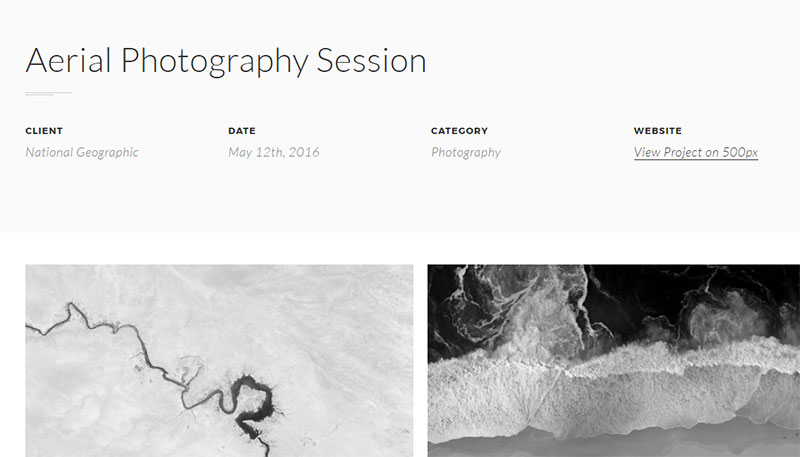
Mandala is an excellent theme demonstrating how simple case studies might look.
The top section includes a sample photo of the project along with extra details like the project date, the category, the client’s name, and a brief project overview.
Give readers a chance to peek behind the scenes and learn more about what you do. Visuals help but they only show part of the story.
By writing case studies you can explain your common problems and how you solved them, along with your brainstorming process for coming up with cool ideas.
If you do photography then you probably won’t have as much to write about. However the Dazzle theme shows that just a little bit of content can go a long way.
Their portfolio theme comes with dozens of styles. Some have little tidbits of information about the project, others have more details on the project page. But either way you can learn a lot by looking through the many styles this theme offers.
Take case studies and really make them your own. Add just enough information to make them valuable to visitors without writing a complete dissertation.
Wrapping Up
Presenting your portfolio work isn’t always straightforward. It differs based on the type of work and how many projects you have.
But the trends I’ve listed above work well for pretty much everything from graphics design to photography, animation, UI work or anything else. Custom slideshows, category sorting, modal windows and case studies can all radically increase engagement on your portfolio website.
If you have yet to start your own portfolio site, you should check out our article on how to build a WordPress portfolio site where we explain how to set up hosting and a theme for your online portfolio.