
The most common structure of any WordPress portfolio site is the grid. It shows a handful of work all at once so the viewer can scan quickly and pick anything that catches their eye.
But what makes a strong grid layout for a portfolio? And what should you consider when launching your own portfolio site?
In this post I’ll share some tips and advice on the best grid layout designs for WordPress portfolios.
Tight Grid Designs
When you’re using a grid it’s wise to keep the design tight. This way the items are close together in proximity to browse quickly and encourage users to interact with the content.
The grid structure usually differs based on the type of portfolio content. You may need to increase or decrease padding depending on your photos and the layout. For example, artwork can feel blurry when close together so digital art portfolios benefit from extra space.
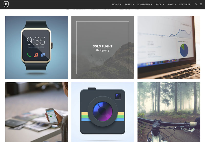
But a designer might keep their work close together because the screenshots are still easy to make out, even from a distance. You can see a nice example in the Ink theme for WordPress.
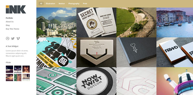
This uses absolutely no padding between any of the grid elements. These square blocks align tight together so the user sees everything at once.
It also uses smaller thumbnails so they tend to grab attention quickly. I really like this style and it’s a personal favorite because it leaves such a strong impression. Notice how each photo is clearly visible contrasted against all the others.
If you have work that can benefit from this style then look into the Ink theme. It’s an easy way to create these types of portfolio grids without coding one from scratch.
But one nice alternative is Bramble, which has a little more space between each piece.
This WordPress theme comes with multiple portfolio layouts so you can actually choose which style(s) you like best. Some portfolio layouts have thumbnails closer together, others have lots of padding between the elements in a grid.
But the #1 thing to consider is analysis paralysis. This occurs when too many choices are presented that can make someone feel unable to pick any of them.
As long as your portfolio entries feel unique and have enough space(or lack of space) to stand on their own you’ll get plenty of clickthroughs. And isn’t that the whole point of a portfolio?
Masonry Grids
Not many people know about masonry grids but they’ve been around for a long time.
These typically use JavaScript to arrange items into a grid based on varying vertical heights. So rather than adding pixel-perfect thumbnails all at the same size you can add different portfolio elements at varying sizes and still get them to fit.
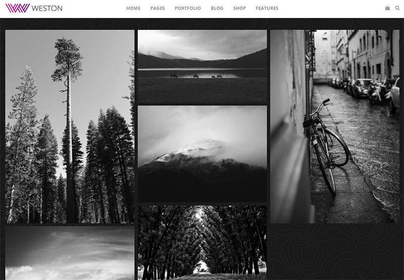
The Weston WordPress theme has this feature in its minimalist photography portfolio page. This naturally targets photographers who want to get their work online, and the masonry grid is a suitable option for variable height photography.
Each photo finds its way naturally into the grid taking up just the right amount of space. You can usually customize the exact number of columns and column height, but remember that it’ll differ based on device size.
If you like fullscreen layouts then take a peek at the Notio theme. It uses a masonry grid design with tight thumbnails and custom animation effects.
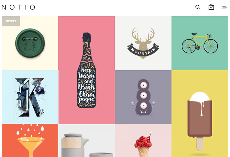
Notice the grids from these two themes also vary in tightness. One has extra whitespace between the images while the other has thumbnails aligned tight against each other.
Grid layouts follow a handful of trends and it’s your choice to follow whichever ones you like best.
Hover Details: Yay Or Nay?
Many portfolios include hover details that appear over the thumbnail while hovering. This effect doesn’t usually carry over into mobile, but it’s definitely a common trend for desktop portfolio sites with big thumbnails.
Each thumbnail should link to the internal portfolio item page, or at least open a gallery of images related to that piece. Thumbnails shouldn’t make up the entire portfolio.
But adding details can encourage higher clicks and get people digging further into the site. The Create WordPress theme uses a custom animation effect while hovering to draw attention to hover details.
When your cursor hovers any portfolio item you’ll find two important tidbits of information:
- The portfolio item’s name/title
- The item’s category
Sometimes these little details can radically improve the user experience. If someone’s browsing for certain graphic design work they can browse by category and check out the titles before clicking.
But other times these details can be unnecessarily verbose and they can take up too much space. That’s why some designers skip these details, like what you’ll find in the WordPress Gather theme.
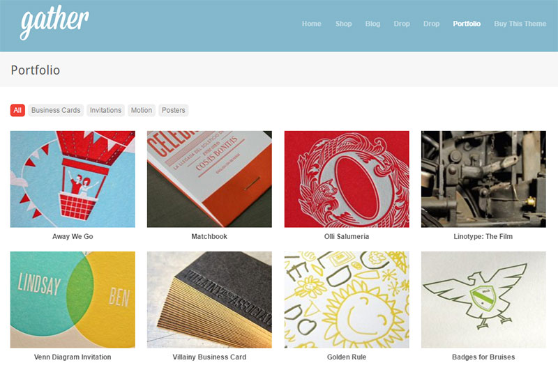
Just plain thumbnails with simple hover effects. Easy on the eyes and all the details are found beneath the thumbnails so they’re not obstructing the image.
This trend doesn’t have a clear “correct” answer. Hover details work great for some, but for others this feature can be a source of minor annoyance.
Find what looks best on your site and gauge based on your own taste. But whether the details appear on hovering the thumbnail, or underneath the thumbnail, try to add them somewhere on the page.
Grab Eyes With Compelling Photos
Every grid layout uses thumbnails to capture attention. These thumbnails typically sell part of your work by encouraging people to click and read more.
Your work might be digital art, web design, icon design, UX architecture, or anything else with visual appeal. But the point is that you absolutely need visual appeal to sell. And that comes from compelling photos.
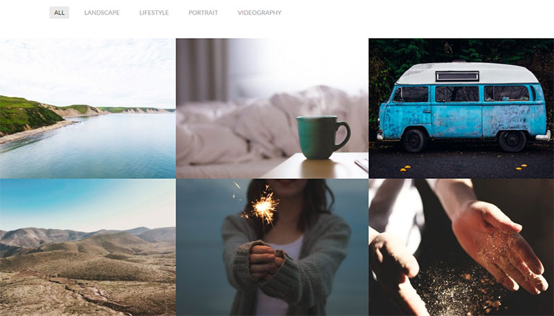
The minimalist Mellow WordPress theme uses a variety of photos each with different styles. These are not “true” project photos since they’re mostly placeholders. But they offer a clear example of selling the visitor right from the first pageload.
I suggest browsing other portfolio sites to see what other designers are using for their gallery pictures.
See what you can use for your own site and what sort of work could draw attention. What best showcases your skillset? What part of each project is most visually appealing or helps to sell your work to others?
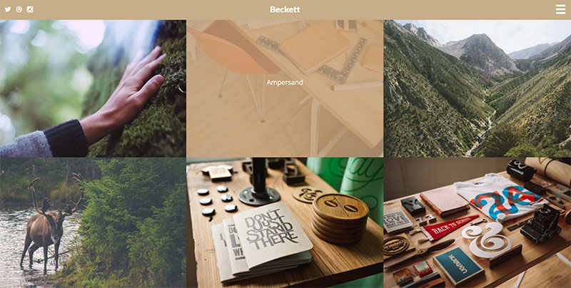
Again this is a very open-ended question but you’ll want to try many different strategies. I typically find that close-up photos garner lots of attention, especially in thumbnail form. You can see a mixture of these examples with the Beckett theme on the portfolio page.
In a grid layout you only have so much space for each project. Make that space count!
If you know exactly how large your thumbnails should be then you’re already at a huge advantage. This lets you crop many different thumbnails in Photoshop to see which compositions you like best for your portfolio items.
Moving Forward
Grid designs are pretty simple and many WordPress portfolio themes come with them by default. But a grid layout won’t offer much without spectacular design work to showcase.
I hope this post offers valuable tips for designers and creatives launching their own portfolios. Grid designs are most common on portfolios so visitors will be expecting them. By applying these trends(or using these themes) you can capture more attention and ideally bring in more client work over time.