The value of good website typography isn’t apparent right away. We tend to be much more design-focused than typography-focused when it comes to building our WordPress websites.
And while there’s nothing entirely wrong with that, maybe let’s take a moment to rethink what good WordPress typography can give us, and why we should spend some time working on it.
The problem with typography in WordPress
As one study by Nielsen Norman Group explains (there are more studies like this), the users generally won’t read through a webpage if the text isn’t clear and the whole thing isn’t easy to follow.
The overall design does play a role here, but good typography is a much bigger piece of the legibility puzzle.
While WordPress is fairly effective at making your website look great, it’s not perfect for everything. And WordPress’s typography has been one of the weaker points.
But don’t get me wrong here, most of the time it’s not even WordPress that we should blame … it’s the themes we use.
Many of them focus on making every little visual detail pixel-perfect, at the same time completely neglecting the fonts and their appearance.
“Hey, let’s just use Arial.” – what many theme developers think.
But the good news is that you can still overcome this issue in most themes, and adjust WordPress typography without doing manual edits to the theme’s source code or changing the theme altogether.
Fonts to never-use on the web
Okay, so just to keep things quick, there are some fonts that you should (probably) never use on your WordPress site if you don’t want to look silly. Let’s not get into the detailed “whys” right now (feel free to google for those), and just list the individual fonts to avoid:
- Comic Sans – It was supposed to be fun and comick-y. It works for neither. It’s the most hated font of all time … for a reason.
- Impact – Albeit a good headline font, it’s a bit overused on the web.
- Franklin Gothic – Known for its newspaper-like classic style, but there are still better solutions if “classic” is what you want.
- Nearly all handwritten fonts – You really need to be careful with those. Most of the time they’re not good for anything other than an occasional call to action or massive headline.
In the end, like with most things, the choice is ultimately up to you. I’m sharing those fonts here only to show you what’s out there, and what other people commonly think is “bad.” Whether you agree or not, it’s always good to have this knowledge.
Don’t think individual fonts, think font pairings
Using just a single font on your WordPress blog can work sometimes, but you’re batter off with a nice font pairing basically 99% of the time.
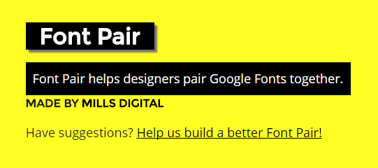
A good place to browse through pre-selected pairings is FontPair.co.
You can start by selecting 3-5 pairings to test for your WordPress typography.
Next:
Calculate the golden ratio for your site
As it turns out, font selection isn’t the only thing that matters when working on your WordPress site’s typography.
Another important detail is the number of characters in each line of text (CPL), and the size of the font compared to the width of the content block.
Quite simply, too many characters in each line, and the text becomes difficult to follow. Too few, and the effect is pretty much the same. To save yourself from this kind of trouble, just use the golden ratio typography calculator.
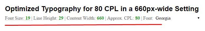
This tool takes a couple of parameters and, in return, gives you guidelines regarding the font size and line-height you should use on your site.
To use the tool, just provide the width of the content block on your WordPress site and your desired CPL (studies suggest to go between 50-75, but that’s brutal for some designs; you can safely aim for 70-90).
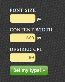
My results:
Change your fonts with a plugin
Okay, so now that we know which fonts we probably want to use, and how big those fonts should be, it’s a good moment to apply all that to our WordPress sites.
The tool/service we’re going to use is Google Fonts. It’s a great (and huge) directory of Google’s own web-tested fonts that are free to use.
The best plugin to use in order to integrate Google Fonts with your WordPress site is aptly called Easy Google Fonts.
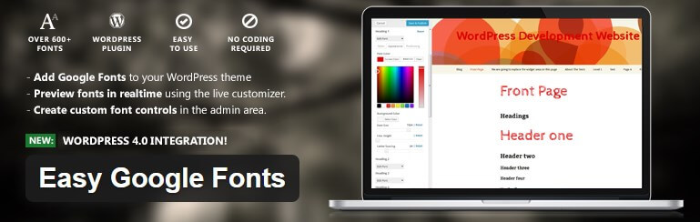
It delivers a ton of features, and basically lets you adjust every little detail about your blog’s typography.
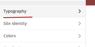
To get started, just install and activate the plugin. Then, go to the WordPress Customizer. You’ll find a new section there, labeled “Typography”:
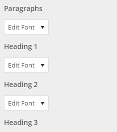
In it, you’ll find individual sections for paragraphs and each of your headings:
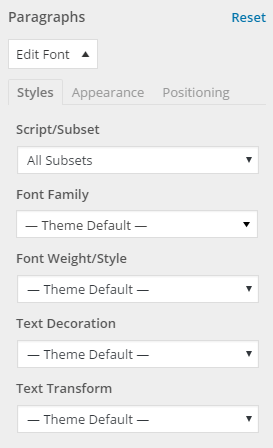
Under each of them, you can adjust the font family, the weights, decorations, and more. This is where you should try out the fonts that you’ve found via FontPair.
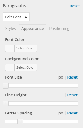
Next, go to the “Appearance” tab and adjust your line heights, font size (keep in mind the golden ratio thing), color, and everything else that isn’t on-point yet.
Best of all, you can see your changes in real time – via the preview panel on the right.
When you’re done, just click the main “Save & Publish” button in the Customizer.
That’s it! You’ve successfully improved the typography of your WordPress site!
If you have any typography-related questions, feel free to submit them in the comments section below.